웹 & 프론트엔드 기본
Bootstrap
Components

Buttons
Buttons
Use Bootstrap’s custom button styles for actions in forms, dialogs, and more with support for multiple sizes, states, and more.
getbootstrap.com
- 여러 크기, 상태 등을 지원하는 양식, 대화 상자 등의 작업에 Bootstrap의 사용자 지정 단추 스타일을 사용
index.html
<!DOCTYPE html>
<html lang="en">
<head>
	<meta charset="UTF-8">
	<meta http-equiv="X-UA-Compatible" content="IE=edge">
	<meta name="viewport" content="width=device-width, initial-scale=1.0">
	<title>Document</title>

	<!-- Bootstrap -->
	<link href="https://cdn.jsdelivr.net/npm/bootstrap@5.1.3/dist/css/bootstrap.min.css" rel="stylesheet" integrity="sha384-1BmE4kWBq78iYhFldvKuhfTAU6auU8tT94WrHftjDbrCEXSU1oBoqyl2QvZ6jIW3" crossorigin="anonymous">
    <link rel="stylesheet" href="./main.css">

	<script src="https://cdn.jsdelivr.net/npm/bootstrap@5.1.3/dist/js/bootstrap.bundle.min.js" integrity="sha384-ka7Sk0Gln4gmtz2MlQnikT1wXgYsOg+OMhuP+IlRH9sENBO0LRn5q+8nbTov4+1p" crossorigin="anonymous"></script>
</head>
<body>
	<br>
	<button type="button" class="btn btn-primary">Primary</button>
	<button type="button" class="btn btn-secondary">Secondary</button>
	<button type="button" class="btn btn-success">Success</button>
	<button type="button" class="btn btn-danger">Danger</button>
	<button type="button" class="btn btn-warning">Warning</button>
	<button type="button" class="btn btn-info">Info</button>
	<button type="button" class="btn btn-light">Light</button>
	<button type="button" class="btn btn-dark">Dark</button>
	<button type="button" class="btn btn-link">Link</button>
</body>
</html>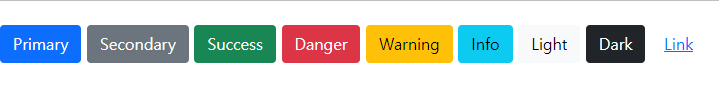
Cards
Cards
Bootstrap’s cards provide a flexible and extensible content container with multiple variants and options.
getbootstrap.com
- 부트스트랩의 카드는 유연하고 확장 가능한 콘텐츠 컨테이너에 다양한 변형과 옵션을 제공
index.html
<!DOCTYPE html>
<html lang="en">
<head>
	<meta charset="UTF-8">
	<meta http-equiv="X-UA-Compatible" content="IE=edge">
	<meta name="viewport" content="width=device-width, initial-scale=1.0">
	<title>Document</title>

	<!-- Bootstrap -->
	<link href="https://cdn.jsdelivr.net/npm/bootstrap@5.1.3/dist/css/bootstrap.min.css" rel="stylesheet" integrity="sha384-1BmE4kWBq78iYhFldvKuhfTAU6auU8tT94WrHftjDbrCEXSU1oBoqyl2QvZ6jIW3" crossorigin="anonymous">
    <link rel="stylesheet" href="./main.css">

	<script src="https://cdn.jsdelivr.net/npm/bootstrap@5.1.3/dist/js/bootstrap.bundle.min.js" integrity="sha384-ka7Sk0Gln4gmtz2MlQnikT1wXgYsOg+OMhuP+IlRH9sENBO0LRn5q+8nbTov4+1p" crossorigin="anonymous"></script>
</head>
<body>
	<div class="card" style="width: 14rem;">
		<img src="https://img1.daumcdn.net/thumb/C428x428/?scode=mtistory2&fname=https%3A%2F%2Ftistory2.daumcdn.net%2Ftistory%2F2820695%2Fattach%2F109aa07fc5d54f73b798198f4775c1a1" class="card-img-top" alt="...">
		<div class="card-body">
		  <h5 class="card-title">SecurityInfo</h5>
		  <p class="card-text">My BLOG</p>
		  <a href="https://securityinfo.tistory.com/" class="btn btn-primary">SecurityInfo</a>
		</div>
	  </div>
</body>
</html>
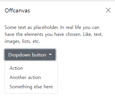
Offcanvas
Offcanvas
Build hidden sidebars into your project for navigation, shopping carts, and more with a few classes and our JavaScript plugin.
getbootstrap.com
- 몇 가지 클래스 및 JavaScript 플러그인으로 프로젝트에 숨겨진 사이드바를 만들어 내비게이션, 쇼핑 카트 등을 이용
index.html
<!DOCTYPE html>
<html lang="en">
<head>
	<meta charset="UTF-8">
	<meta http-equiv="X-UA-Compatible" content="IE=edge">
	<meta name="viewport" content="width=device-width, initial-scale=1.0">
	<title>Document</title>

	<!-- Bootstrap -->
	<link href="https://cdn.jsdelivr.net/npm/bootstrap@5.1.3/dist/css/bootstrap.min.css" rel="stylesheet" integrity="sha384-1BmE4kWBq78iYhFldvKuhfTAU6auU8tT94WrHftjDbrCEXSU1oBoqyl2QvZ6jIW3" crossorigin="anonymous">
    <link rel="stylesheet" href="./main.css">

	<script src="https://cdn.jsdelivr.net/npm/bootstrap@5.1.3/dist/js/bootstrap.bundle.min.js" integrity="sha384-ka7Sk0Gln4gmtz2MlQnikT1wXgYsOg+OMhuP+IlRH9sENBO0LRn5q+8nbTov4+1p" crossorigin="anonymous"></script>
</head>
<body>
	<a class="btn btn-primary" data-bs-toggle="offcanvas" href="#offcanvasExample" role="button" aria-controls="offcanvasExample">
		Link with href
	  </a>
	  <button class="btn btn-primary" type="button" data-bs-toggle="offcanvas" data-bs-target="#offcanvasExample" aria-controls="offcanvasExample">
		Button with data-bs-target
	  </button>

	  <div class="offcanvas offcanvas-start" tabindex="-1" id="offcanvasExample" aria-labelledby="offcanvasExampleLabel">
		<div class="offcanvas-header">
		  <h5 class="offcanvas-title" id="offcanvasExampleLabel">Offcanvas</h5>
		  <button type="button" class="btn-close text-reset" data-bs-dismiss="offcanvas" aria-label="Close"></button>
		</div>
		<div class="offcanvas-body">
		  <div>
			Some text as placeholder. In real life you can have the elements you have chosen. Like, text, images, lists, etc.
		  </div>
		  <div class="dropdown mt-3">
			<button class="btn btn-secondary dropdown-toggle" type="button" id="dropdownMenuButton" data-bs-toggle="dropdown">
			  Dropdown button
			</button>
			<ul class="dropdown-menu" aria-labelledby="dropdownMenuButton">
			  <li><a class="dropdown-item" href="#">Action</a></li>
			  <li><a class="dropdown-item" href="#">Another action</a></li>
			  <li><a class="dropdown-item" href="#">Something else here</a></li>
			</ul>
		  </div>
		</div>
	  </div>
</body>
</html>
오늘은 Bootstrap button card offcanvas에 대해서 학습해보는 시간을 가졌다. 코드 붙여넣으면서 바꾸고 싶은 것 있으면 바꿔보면서 재미나게 학습할 수 있었다. 버튼, 카드, 활용 용도가 정말 많은 것 같았다. 주로 버튼 이쁘게 꾸미고 싶어서 CSS 들어가서 해당 항목들 찾아서 입체 입히면서 작업을 많이 하곤 했는데 여기 있는 디폴트 버튼도 나빠 보이지 않았다. 특히 카드가 마음에 든다. 간단하게 블로그로 연결되는 카드를 만들어봤는데 이쁘게 나온 것 같아서 마음에 든다. 오프캔버스는 토글을 껐다 켰다 하면서 신기함을 볼 수 있었다.
99일 차는 여기서 마무리하고자 합니다.
패스트캠퍼스 링크 :https://bit.ly/37BpX
패스트캠퍼스 [직장인 실무교육]
프로그래밍, 영상편집, UX/UI, 마케팅, 데이터 분석, 엑셀강의, The RED, 국비지원, 기업교육, 서비스 제공.
fastcampus.co.kr
'FastCampus > 한 번에 끝내는 파이썬 웹 개발 초격차 패키지 Online.' 카테고리의 다른 글
| 한 번에 끝내는 파이썬 웹 개발 초격차 패키지 101일차 (0) | 2021.12.15 |
|---|---|
| 한 번에 끝내는 파이썬 웹 개발 초격차 패키지 100일차 (0) | 2021.12.14 |
| 한 번에 끝내는 파이썬 웹 개발 초격차 패키지 98일차 (0) | 2021.12.12 |
| 한 번에 끝내는 파이썬 웹 개발 초격차 패키지 97일차 (0) | 2021.12.11 |
| 한 번에 끝내는 파이썬 웹 개발 초격차 패키지 96일차 (0) | 2021.12.10 |


댓글